Beautiful Constraint
 ·
I like tools that make good decisions on my behalf. Especially about things I care about, but don’t want to spend time adjusting.
How my notes look is one of those things. I want good typography and a pleasing layout. When I’m writing, though, I just want to focus on the writing.
I’ve approached building client websites in much the same way for at least twenty years.
Give someone too many options in a content management system and they’ll eventually ruin the design. Usually by changing font sizes. Or introducing a new colour. Or centring a paragraph that really shouldn’t be centred.
So I give them a set of things that work together. Blocks, a fixed palette, a few layout choices. The design decisions are built into the tools they use.
The constraints are what keep it beautiful.
I’d always thought of this as part of building websites. Then I read John Gruber, who writes Daring Fireball, making the same case about Apple Notes.
He calls it “prestructured WYSIWYG”, and I’m annoyed I never thought to name it myself.
It’s the kind of editing you get in Apple Notes. You can make a heading, emphasise a word, add a list or link or photo. You get a useful set of formatting choices, without having to choose typefaces or decide how big a heading should be.
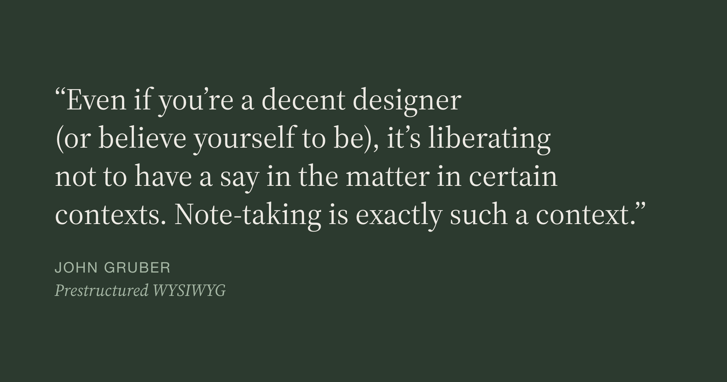
As Gruber puts it:
Even if you’re a decent designer (or believe yourself to be), it’s liberating not to have a say in the matter in certain contexts. Note-taking is exactly such a context.
Spot on. When I’m writing, I don’t want to make design decisions. I shouldn’t be expected to. The app should take care of how my notes look.
Earlier this month, I wrote about why I’m building a Markdown notes app even though I don’t particularly like writing Markdown. I talked about ordinary files, ownership and keeping the syntax out of sight.
But Markdown’s constraints matter too. It’s prestructured by design: you can mark a heading, a quote or a table, but there’s no way to pick a font, a size or a colour.
That’s what I’ve been doing with websites all along: make the design decisions once, so the people using them can get on with what they came to do.
Soot is built the same way. I want my notes to look beautiful without having to make them beautiful every time I write.
Want to try Soot?
Soot is a simple notes app for Mac, iPad and iPhone: a calm place to write. See what it does. If you’d like to try it, leave your email and I’ll invite you to the beta, then let you know when it launches.